Top 12 Examples Of Great SEO and UX from Ecommerce Websites
How to

Anyone in the online retail game knows that the challenge only begins with the products you offer. Unless you're fortunate enough to have cornered the market in a certain area (and have the significant advantage of being the only game in town), you're going to be competing against a massive range of similar businesses offering similar things at similar prices.
Now, if you think that sounds very stressful, you're correct. You're fighting against not only the doubts and reservations of your prospective customers but also the countless stores around you clamoring for transactions. How is anyone supposed to get ahead in that scenario?
The answer (while incredibly difficult to achieve) is actually very simple: have a better user experience (UX) than your rivals. The better your UX, the more leads you'll convert into customers, and the better your on-page metrics will be: metrics that will feed into your rankings and win you the favor of the almighty Google.
And though I certainly don't have all the answers when it comes to turning your online store into revenue-reaping powerhouse, plenty of businesses do – so we're going to take a look at some ecommerce websites to pick out some great parts. Let's first dig a little deeper into the overlap between SEO and UX, then look at 12 examples of brands being masterful with UX design to rustle up some rankings.
Where SEO and UX Elements Intersect
Much of what we'll see here ultimately relies on the use of dual-purpose elements: technical inclusions that essentially serve the same roles whether they're being used by people or by search crawlers. Build your website around them and any polish you give it will increase its overall quality. So they include SEO and UX together.
A good comparison in the tech world at the moment is progressive web apps: instead of having websites for browsing and apps for serious personalization and optimized mobile use, developers are creating websites designed specifically to achieve all of the above. As a result, they will have no need for separate app and website update teams.
If you break a UX design down into its component parts, you can easily start assessing different elements based on how much dual-role potential they have. Let's look at some top contenders:
- Breadcrumbs. Reflecting both the path taken to reach a certain page and the overall page hierarchy of the site, breadcrumbs perfectly exemplify the dual functionality I mentioned. The user benefits by being reminded of where they've been and being given opportunities to adjust their path, and the search crawler benefits by having a clear and unmissable layout of the site.
- URL structures. If you visit some of the sites linked to later, you'll be able to look closely at their URL structures, which are important for much the same reason that breadcrumbs are when it comes to search crawlers. For users they're less significant, but a simple URL is easier to remember and type, and if you have a very intuitive URL structure, users will be able to make direct URL changes to reach different categories if needed.
- Metadata. While meta descriptions are only used for search results (and even then, only sparingly), and meta keywords are no longer considered at all, there are still significant metadata elements in the form of page titles and alt text.
- Page Titles influence the titles in results pages, determine what the user sees when they hover over the tab (or look at the title bar), and will be taken into account by crawlers when categorizing pages. It's an HTML element that is usually placed in the section of the webpage.
- Alt text is important because search crawlers aren't good at telling what images are about, and because accessibility is very important for UX in the event of someone with a visual impairment trying to use your site. So don't underestimate this attribute if you want to optimize your website for image search. Usually it looks like this:
<img class="img-responsive" src="https://static.netpeaksoftware.com/media/image/owl-attack.jpeg" alt="Example of owl attack">
- Microdata. Typically meeting the Schema.org standard, microdata is an interesting case. While it is intended to provide clarity to search engines about what page content consists of, it also serves the user in two ways: firstly, it encourages the content creator to cover a wide range of information, and secondly, it allows them to sometimes find the information they're looking for directly in Google (not good for getting clicks, admittedly, but if the featured snippet has clear attribution, it will earn goodwill for the brand).
All this said, most of the examples I'm using focus on broader design elements. Why? Quite simply, because most websites of a decent quality today will handle everything above very sensibly. By the way, you can check out the statistics on some interesting UX facts and users' behaviour to make sure that it's true. Notably, any website built using a standardized CMS will default to a logical URL structure and title system, and breadcrumb systems are easy to implement.
Ultimately, the differentiation in the best sites comes down to design elements swaying the all-important On-Page metrics. Let's now take a look at the examples I promised!
1. ASOS
ASOS is a clothing brand that often gets mentioned for its terrific website design, and it's a bandwagon I'm happy to remain on, because the site is really nicely done. All the colors pop with bold crispness, and the imagery is always creative. For the title, 'Online Shopping for the Latest Clothes & Fashion' is perfect. Why?
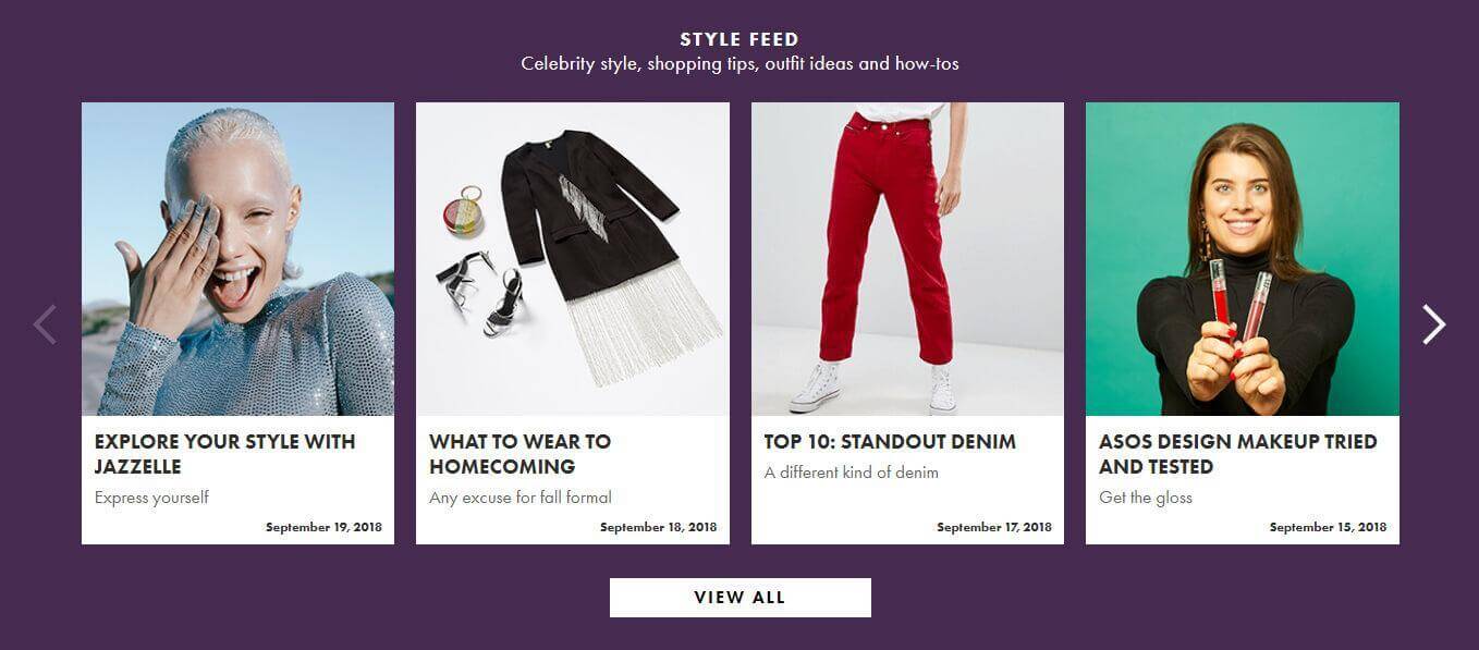
Because something you'll notice again and again throughout this piece is the smart mixing of UX and SEO elements – top keywords and search terms sprinkled throughout for search crawlers ('TOP 10', 'TESTED', 'WHAT TO WEAR'), but used only when relevant, and dressed up in appealing visuals to ensure the best of both worlds.
2. Simply Chocolate
I like chocolate as much as the next person, assuming the next person really likes chocolate, and Simply Chocolate has me through its name alone – but even more so through its product content and presentation, as seen below (I will say that the page title is underwhelming, but I suppose it relies heavily on the product name).
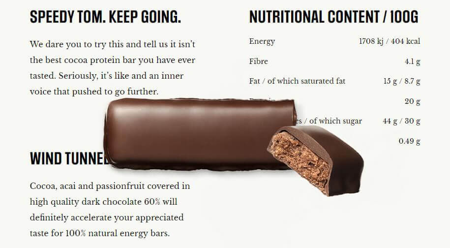
In most cases, you'd see a product image and a nutrition section provided separately, but no so here. Instead, as you scroll down the page, the bar floats ethereally above the text, making sure that you have access to the data you need but can't escape the tempting sight. Since the bar in question is intended as a health product marrying taste and nutrition, it makes total sense that the design reflects that.
3. Dollar Shave Club
If you haven't heard or seen an ad for Dollar Shave Club, I'll assume you've never listened to a podcast of any variety, because I find them inescapable. I don't hold it against the company, though – its design principles are consistently outstanding, and the products (though I've never used them) seem to be excellent. The homepage title is about right: 'Shave and Grooming Made Simple'.
While there's a whole website to enjoy, I've picked out the help center because it's so crisp and simple. The monochrome and seemingly hand-drawn icons provide a feeling of ease (so important when someone is getting stressed about a problem with their order) and the user can rapidly find what they're looking for with the logical categories. Also, you can find online chat on the website which makes your communication with clients more convenient.
4. Protest
Sporting goods require a delicate rhetorical touch, because they need to come across as both stylish and practical, and Protest does some great work on its store. Not only do the products look good, but they're neatly categorized. The page titles are basic but adequate, likely auto-generated.
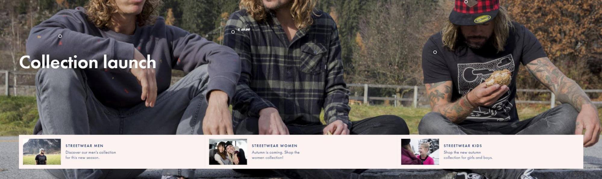
That's not why I chose to highlight this company, though. I made that choice because of the glorious animations. Every time you move your cursor across this site, you'll see a cascade of delightful animations spring to life – you can even hover over the dots on the items of clothing to see prices pop up. Great fun to browse. I also love the Open Graph description: 'Founded in 1993 by a small group of snowboarders in Holland. That's right: Holland. To hell with logic - Let's do what we love.'
5. Ikea
Everyone knows what Ikea is about, so I won't do much to introduce the company. But it also has a website, and a pretty good one, too. The title of 'Home furnishings, kitchens, appliances, sofas, beds, mattresses' unfortunately can't encompass everything on offer.
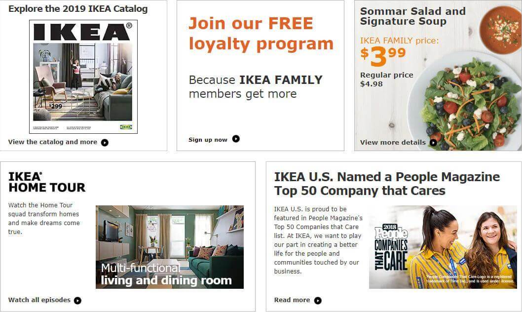
The modular panel-based design aesthetic is ever-popular because it's so good for responsive rearrangements, and it's used really nicely here. Not only do these panels look good and inform the reader, but they're also entirely actionable. 'Read more', 'Watch all episodes', 'Sign up now': every single panel has a new page to visit, bumping up the ranking potential.
6. Paste
I previously had a different page here, but evidently the company was absorbed by another, and that terrific page was unfairly removed. But not all is lost: the parent site is still terrific in the same kind of way, as evidenced by the Paste page in particular. Paste is a tool for gathering rich visual information, including slides, images, text, links, and various other elements.
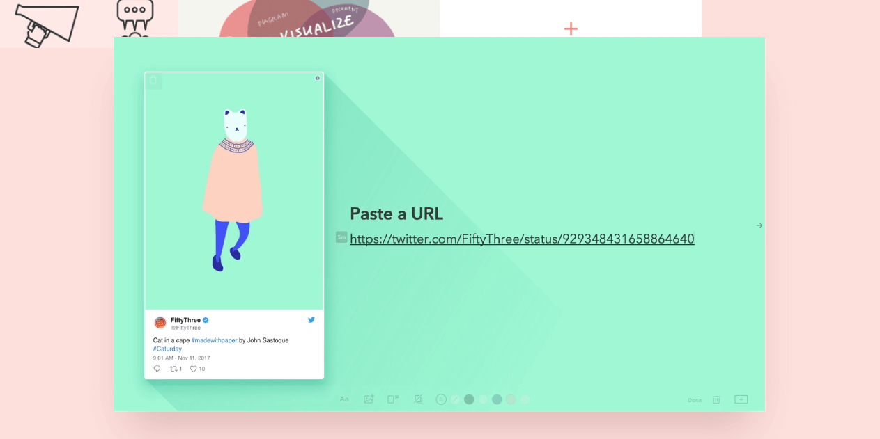
This page is such a delight to scroll through because it doesn't just tell you what the tool can do: it shows you. Tiles glide in and out of formation, and slick animations demonstrate the features and talk you thought them at the same time. When the central appeal of the tool is that it will save you time and effort, the UX must reflect that by making it quick and easy to see how the tool works – and it does. The page is also marked nicely for Open Graph, making it great for sharing through Facebook.
7. Etsy
In a retail world dominated by Amazon, Etsy found a way to carve out a new path based on homemade goods and homespun charm, and its success is entirely deserved. If you're looking for something a little different, it might be the marketplace for you – 'Shop for anything from creative people everywhere' is an appropriate page title.
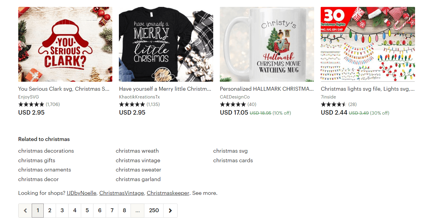
And while it's no surprise that its product range reflects the season (people in the crafting world are always going to take that route wherever possible, because it's fun), you might expect the presentation to be a bit looser but it's actually very nicely done. The above categories are extremely useful for prospective customers and for bringing in some hyper-relevant seasonal traffic through SEO.
8. Vans
Various clothing and footwear companies have come to recognize the value of allowing customization, and I actually had Adidas here initially because I really liked its customization section, but then I saw the equivalent page for Vans, and realized I'd made a tiny mistake.
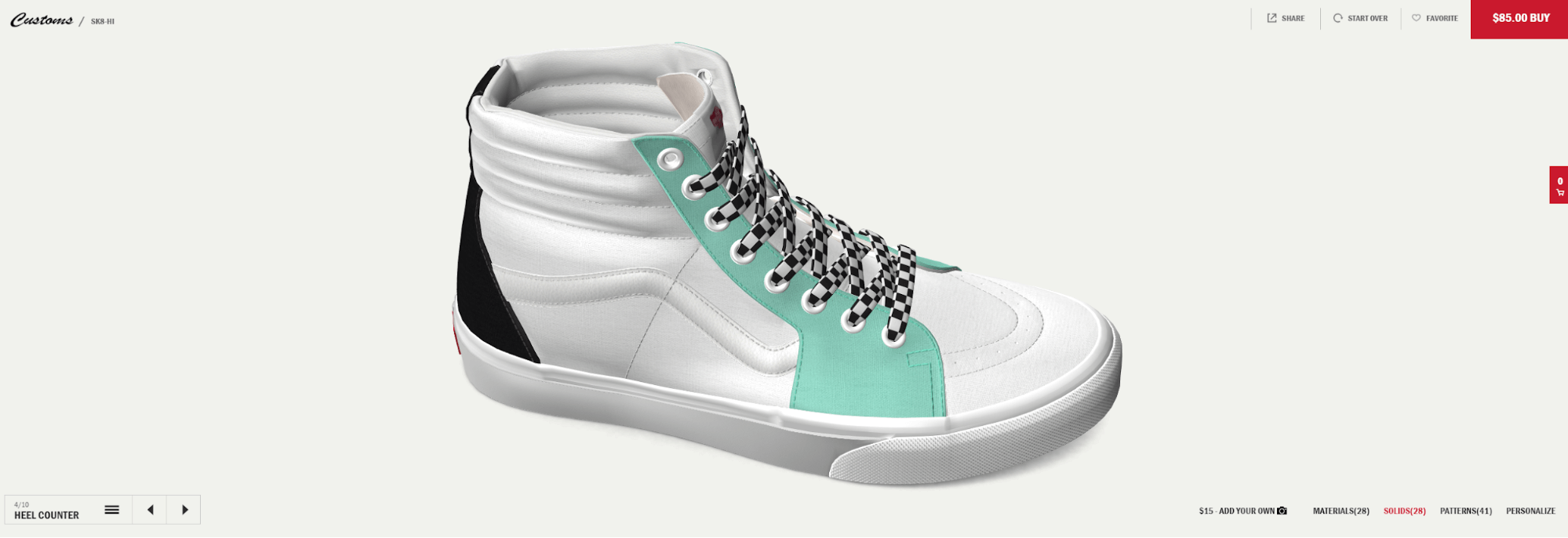
What's so special about this particular page? Well, the comparable Nike page gives you static images, and the Adidas page gives you an incremental lateral rotation, but Vans gives you a freely-adjustable 3D model of the shoe as you customize it. You can zoom in and out, and get a crystal-clear preview of the changes you're making. You can even personalize the shoe with your initials. As a result, it's the best page of this kind that I've seen, providing an exceptional level of UX.
9. Exchange
Website flipping, or the practice of buying and selling websites as digital assets, has exploded in recent years due to the growth of digital infrastructure and Ecommerce in general. If you don't want to trade stocks, you can trade stores (just remember to follow this checklist), and Exchange is one of the leading marketplaces.
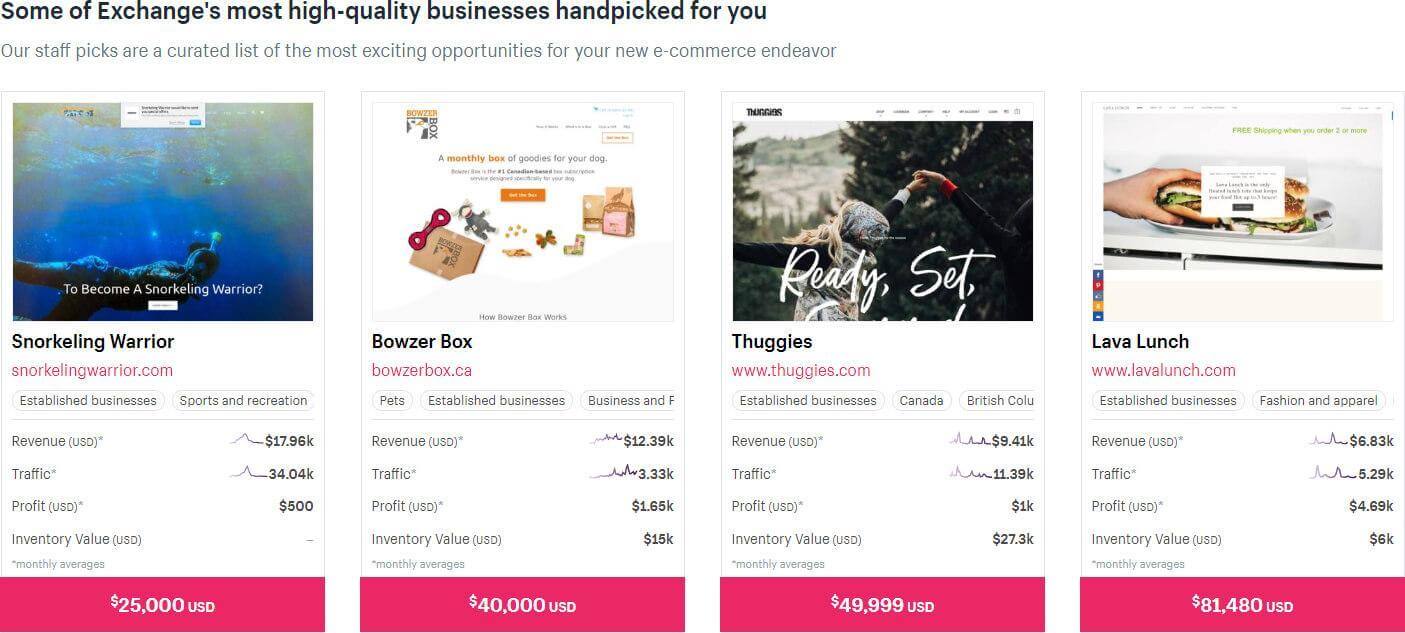
What I like so much about the main Exchange page is that it really heaps on the keywords but in a way that makes total sense for the user. Sure, you can attribute SEO efforts to the existence of a specific section for established businesses under $5000, but those are precisely the kinds of parameters website flippers care about, so it's a win-win. The title of 'Ecommerce Websites & Businesses for Sale | Buy and Sell Online Sites' is perhaps over-optimized, but has also clearly been written for SEO purposes.
10. Firebox
I haven't purchased much from Firebox, partially because I'm cheap and partially because I get so much value from the copy and style of the website that I feel satisfied (they do deserve some retail from me, though, so I'll get to it). And I love the page title of 'Unusual Gifts for People with Imagination'. That's a great title for a results page.
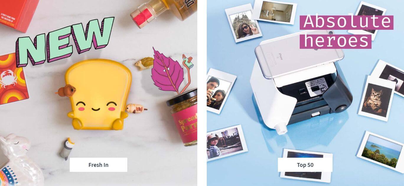
The entire Firebox site is a triumph of presentation, but with the necessary functional sprinkles added on top. For instance, see the panel on the right: 'Absolute heroes' is a great hook for the visitor, but you also have the muted 'Top 50' on the button to make it clear (particularly for the search engines) what the linked page is about. Every product page is marked for Open Graph and given accurate alt text tags, as you'd expect from such a sharable site.
11. Home Depot
Need to build, demolish, improve or ruin a house? Home Depot is a good place to go. That's about the extent of my experience with it, aside from thinking it has a top-notch website from which I'm always happy to buy. The basic automated page titles are bland, but about what I'd expect from a brand with such a vast and ever-changing product range.
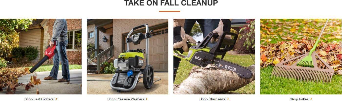
We've touched upon seasonal matters, and what you can see above is a smart and efficient rearranging of basic panels. The categories in question already existed on the system, but since fall has arrived, the company simply added a 'TAKE ON FALL CLEANUP' panel and threw in the most relevant tiles. Convenient for the customer, profitable for the business, great for SEO.
12. Bellroy
Bellroy makes and sells carry goods, so everything from wallets and bags to phone cases and key covers and its homepage is incredibly simple. Really, you'd struggle to strip it down more. The title of 'Considered Carry Goods: Wallets, Bags, Phone Cases & More' is spot-on.
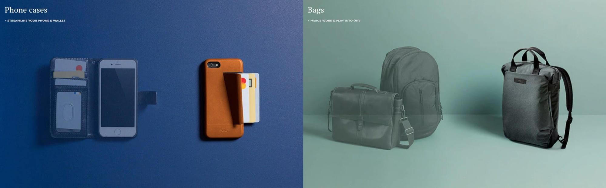
We've looked at numerous stores that nicely merge UX and SEO demands, but this is the top dog when it comes to that approach. If you removed all the visuals from the page, you'd be left with a super-basic set of titles and actions, and since that's everything you need for Ecommerce, that's definitely a good thing. And since the images are sparse and the video is embedded (and embedded well), the page stays fast and responsive.
In Essence, Just Keep the Customer Happy
As you may have noticed, doing great UX for SEO is really just about impressing the customer to the extent that they'll stick around, buy more things, and keep sending clear signals to Google that the users of your site believe it to be high-quality and relevant.
If your website isn't managing to keep people around, try learning from these examples and switching up your presentation accordingly. It might be just what you need!