Mobile SEO: Creating a Mobile-Friendly Website Without a Hassle
Site Audit Issues

Most websites you discover online are optimized for mobile devices. This has never been more important — especially after Google introduced mobile-first indexing. Creating a mobile-friendly website can ensure an excellent user experience, improve your SEO rankings, and build a better image for your target audience.
This post will explain the importance of mobile search optimization and show you how to ensure your website is well-groomed for mobile devices.
What is mobile SEO?
Mobile SEO practically means optimizing a website to help it rank higher in search results on mobile devices like smartphones and tablets and provide greater UX. Even though it includes practices and approaches similar to desktop SEO, it still plays a crucial part in your website's online promotion.
Since people worldwide have never been closer to their smartphones and other mobile devices, it's pretty clear why mobile optimization should be a priority for website owners and businesses. Creating a mobile-friendly website includes creating a more convenient design, properly optimizing its content, and targeting proper keywords, as they might also differ for desktop and mobile SEO optimization.
Why is mobile optimization important?
Mobile devices are of constant access to users. Most online inquiries come from smartphones or tablets. Moreover, after Google started using mobile-first indexing, the mobile version of your website has practically become the only one that counts in terms of search engine rankings. That means your website promotion directly depends on how well-groomed your website version is for mobile users.
3 ways to configure your website for mobile devices
There are three main ways to create a mobile-friendly version of your website, so let's unpack each one of them.
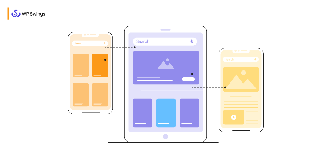
Creating a responsive design

Responsive design is what helps you properly display the same page to people using different types of devices. While the server sends the same HTML code, the CSS changes the way your page renders on a given device.
Here's why implementing a responsive design works great for mobile search engine optimization:
- It lets users link to your content with a single URL rather than using a separate "mobile" URL;
- Responsive design lowers the chances of mistakes that affect mobile-friendly sites;
- It's less time-consuming and more convenient to maintain;
- Implementing a responsive design doesn’t require redirection to provide a mobile-optimized view;
- It saves resources when Google crawls your site since Googlebots will crawl the page just once;
- With responsive design, you won’t have to deal with duplicate content issues or redirects;
- There's no need to worry about the design since the layout always appropriately adjusts to different device types.
Integrating dynamic serving

Using the dynamic serving method, you'll see the different HTML on your device, but the URL will remain the same. The content usually remains within the same URL, but the server provides a different code to each device.
However, there are better options than using dynamic serving, as it's full of technical issues. For example, with dynamic serving setups, mobile users can see a desktop version of the page on their device. Usually, it leads to plenty of inconveniences and poor UX.
Using separate URLs
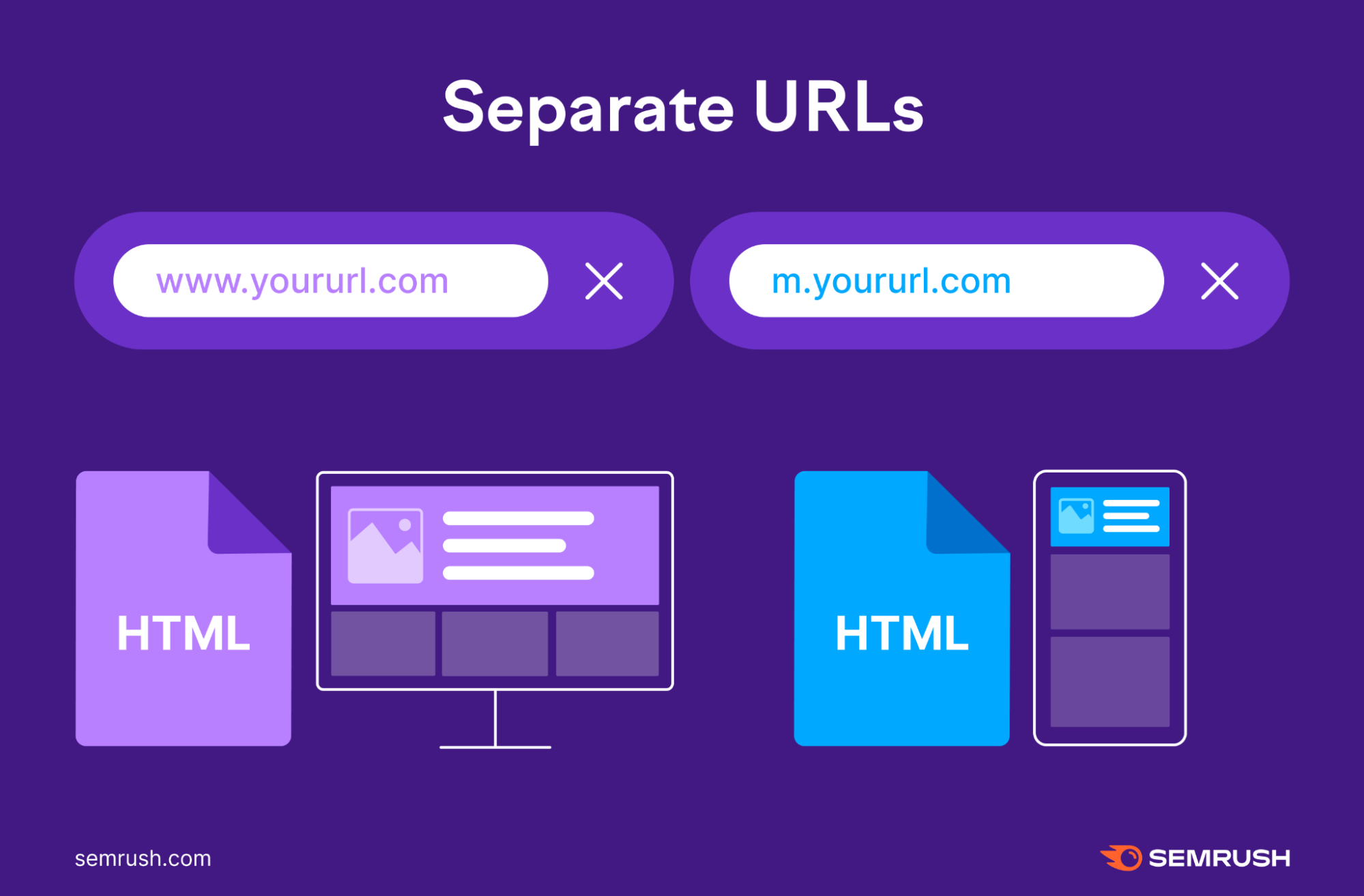
Another mobile SEO option might be setting up separate URLs for different site versions, meaning you’ll have one URL for the desktop version and another one for the mobile version of your website.
However, Google recommends avoiding this approach. Here's why: when you visit a site, the server defines what device you're using and directs you to either the mobile or desktop version of your site. Managing this can take a lot of time and effort.
And, since there are two versions of every page on your website, you’ll have to add either rel="canonical" tags or rel="alternate" tags to their HTML codes to let Google detect the primary version of each page correctly.
Here's how you should do it:
- On mobile pages, set up a rel="canonical" tag directing to the desktop version
- On desktop pages, set up a rel="alternate" tag directing to the mobile version
Otherwise, Google may register both mobile and desktop pages as duplicate content, which may be confusing to the search engine while trying to define which page to rank.
Best ways to check if your site is mobile-friendly
Now that you know what SEO for mobile is and how to configure your website for smartphones and tablets, let's see how you can check whether it's mobile-friendly and well-optimized.
Google Search Console
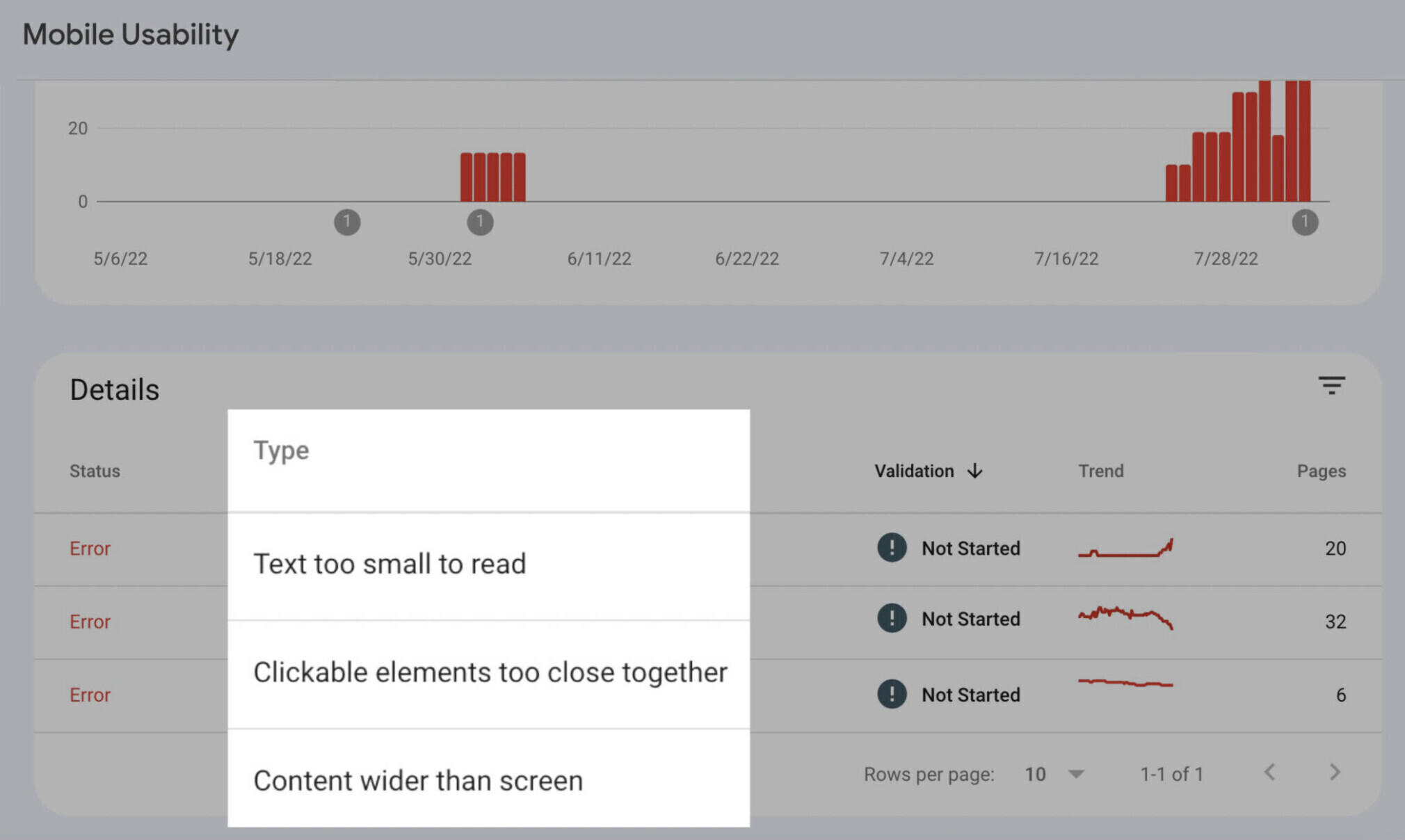
Google Search Console allows you to see how mobile-friendly your website is — go to "Mobile Usability" in the sidebar and see if there are any issues. For instance, it can detect readability problems or issues with clickable elements.
Use a Mobile-Friendly Test tool
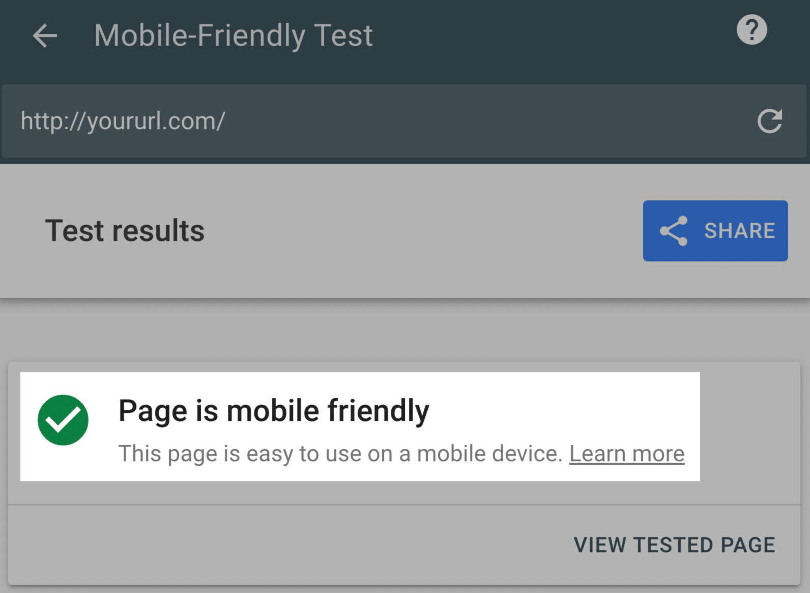
Google's Mobile-Friendly Test tool is another option you can use to check how well your mobile SEO strategy works. There's no need to log in to your Google account — all you have to do is paste the URL into the search bar. If your site isn't optimized enough, you'll see the errors it has detected, together with a brief explanation of what each issue means so you can solve it correctly.
Google PageSpeed Insights
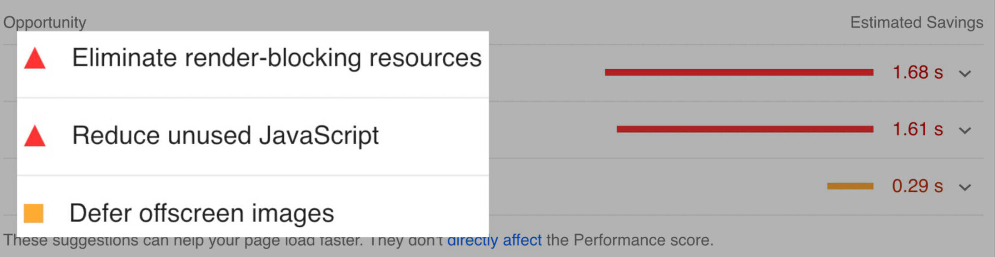
Google's PageSpeed Insights evaluates page experience, including its loading speed and the Core Web Vitals. If your page loads in under a second, consider it well-optimized. If there are any issues, you'll see a dedicated report together with the best suggestions for solving them and increasing page speed.
10 tips on creating a mobile-friendly website
If you see your website needs to be better optimized for mobile devices, here are some of the most efficient tips that'll help you solve this problem and enhance your SEO strategies for mobile devices.
Create a responsive design

The approach of responsive design suggests that the development and design of a web page should align with the user's behavior and environment, which is screen size, orientation, and platform. Basically, the responsive design consists of various flexible grids and layouts that automatically switch according to the device's scripting abilities, image sizes, and resolution. Thus, you'll streamline the website's UX and its usability.
Optimize for proper page speed on mobile devices

Strong page speed performance has never been more essential for mobile friendly SEO. Even when Google made the Core Web Vitals a ranking factor, its primary focus was mobile performance only, and the tendency persisted. Hence, you must ensure your page speed is high on both desktop and mobile versions. To help you with that, try Google Search Console and PageSpeed Insights.
Test and check your website for errors

Running regular SEO checkups is crucial for ensuring proper website optimization for both desktop and mobile versions. For that purpose, use dedicated website crawlers and analytical tools like Google Analytics or Search Console, PageSpeed Insights, Netpeak Spider, and others.

Make sure your content is mobile-friendly

For that purpose, you can use Google's dedicated tools and sources. They're free to use yet provide detailed insights on how you can improve your website's search engine optimization for mobile devices. Another option would be checking out how your website displays content on different types of devices and detecting visual issues yourself.
Your goal here should be enhanced readability. To do so, try breaking your copy up by adding various elements and media:
- Numbered lists;
- Images;
- Bullet points;
- Quotes;
- Videos.
Do an optimization for mobile SERPs

Mobile SERPs or search engine results pages can differ considerably between mobile and desktop versions. As you're browsing the SERPs for a chosen keyword, better check both the desktop and mobile results manually.
Make sure to integrate mobile-friendly navigation
When optimizing a mobile version of your website, think of implementing the header navigation since this is one of the most complex website areas to work with for smartphones and tablets.
One of the most popular options now is hamburger menus. This type of optimization is nice and compact, and users get more accustomed to these on mobile gadgets. However, other types, like the "mega menu," can work well for your website, too. The main rule here is to ensure the same links within both desktop and mobile versions.
Keep the same content on both versions

Maintaining parity between mobile and desktop site versions is essential to avoid confusion among users and maintain an excellent UX. If you remove some content from the mobile version of your site, Google might consider it as weakening your content.
The rule of content parity has to apply to all types of content as well as technical items like canonical tags or internal linking. To test if your website maintains proper mobile parity, run a website crawl on both versions and compare the results.
Avoid intrusive interstitials
Intrusive and distracting interstitials (i.e., pop-ups) are usually quite frustrating, especially for mobile users. These pop-ups often take up an even bigger portion of the screen and prevent users from accessing a particular button or content piece.
Run mobile performance reviews
It's essential to add regular performance reviews to your SEO routine to ensure your website's mobile version keeps up a good job. This will help you detect the weak spots and quickly react to them before they lead to more significant problems. It's worth running such reviews via several services (for example, PageSpeed Insights and Google Analytics) to get an overarching image of what's going on with your page.
Run efficient website audit with Netpeak Spider
Mobile friendly SEO for websites is vital for any business that wants to succeed, and it will only happen if you keep track of your performance on a regular basis. Thankfully, you can now try multiple tools to help you with that, and Netpeak Spider is among them.
This website crawler runs in-depth SEO audits and delivers reports in a few minutes. Here, you can analyze your website's metrics and enrich your reports by retrieving data from Google Analytics and Search Console. Moreover, Netpeak Spider can detect over 100 website-related issues.
The tool is extremely easy to work with, too. All you need to do to receive your website's checkup results is this:
- Make up a list of URLs you need to analyze and upload it into Netpeak Spider; alternatively, you can paste this list from a clipboard into a built-in search bar;
- On the right sidebar, select the parameters you want to check;
- Click "Start" and launch the crawling process.
You try the app for free first to check if it's a good fit for your daily SEO needs. It's now available for Windows and macOS to pick any preferred OS and check your website data in real time.
Bottom line
After Google introduced mobile-first indexing, it's become crucial for every business to optimize their websites for mobile devices, thus making mobile SEO a top priority. Thanks to modern tools and services, it's possible to maintain a well-optimized mobile version of any website, which indeed helps them rank higher and enhance user experience.
However, it's also necessary to regularly check your website for mobile optimization and ensure its metrics are still good, and Netpeak Spider is the perfect option for that purpose. Try it today and start boosting your mobile SEO performance right away!
.png)