Ecommerce Website Structure and How to Get it Right
How to
Website structure is a major deal for Ecommerce website SEO. It should be borne in mind in the first place – even before you start drawing the first prototypes and design elements. If you fail to do this in advance, problems may appear that are difficult to fix later. For example, there will be no space for links to pages, or that it’s impossible to place some items in the top menu if it is limited. Unfortunately, many specialists neglect the planning of the structure and knock together half-baked website structure at the last moment, and when problems arise, they hastily try to remake it.
- 1. The Benefits of Having a Good Ecommerce Website Structure
- 2. Plan Out a Hierarchical Ecommerce Website Structure
- 3. Plan a URL Structure that Complements the Hierarchy
- 4. Choose the Right Categories and Tags
- 5. Create a Homepage That Links to Categories and Products
- 6. Use Pagination for Categories
- 7. Extensively Use Internal Linking
- 8. Fix Broken Links
- 9. How to Check Ecommerce Website Structure with Netpeak Spider
- The Bottom Line
Read more → How to plan a website structure
1. The Benefits of Having a Good Ecommerce Website Structure
Good Ecommerce website structure is important for both users and search robots. And here, I listed some evident benefits.
1.1. Sitelinks Will Be Displayed on Google
Sitelinks are links to your website that get displayed below the link to your homepage on Google. An example can be seen in the below screenshot.
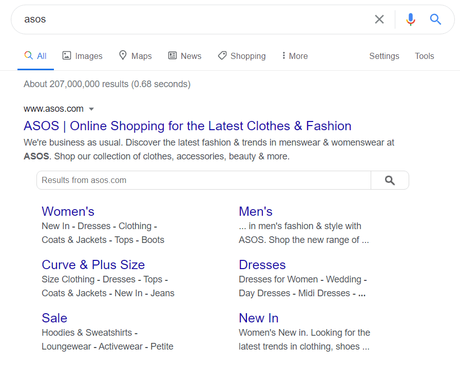
As you can see, the link to the homepage appears at the top. You also have links to the internal pages like the 'Women's' page, the 'Dresses' page, and the 'Sale' page below it.
The main benefit of having this is that it will help people find the most relevant page on the fly. For example, someone interested in buying dresses can click on the link to the ‘Dresses’ page and buy products.
This will reduce the number of steps in the funnel and increase conversion rates because people go directly to what they want to know or buy. Ensure your sitelinks get displayed on search results by having a good Ecommerce website structure and structured data.
Note that Google doesn't guarantee that a sitelinks search box will be shown in search results.
1.2. Improved Website Crawling
It is important for you to have a good website structure that ensures that search robots understand which pages are important for the webmaster and the target user. SEO reps adhere to the rule of three clicks, where the most important pages should be nested not further than three clicks away from the main page. Otherwise, search engines may not index the page, do it later, or its priority will be very low. And obviously, if more pages get crawled, they will appear on Google and rank for the keywords they were optimized for.
1.3. Better User Experience and Conversion Rates
When people visit your website they expect things in certain places. And if they are in the right place, they will click on these items, visit the different pages on your website, and remain there for longer.
This will directly affect increasing your conversion rate, but it will also have an indirect effect on SEO. You see, Google considers user experience while ranking your website on search engine.
Therefore, if users stay on your website for longer and visit other pages and your bounce rate goes down, Google will move up the rankings.
1.4. Coverage of Larger Group of Queries
Additional sections, categories, and landing pages created for narrow groups of queries make it possible to rank for an extended keyword group. Such pages will be more relevant to the specific group of queries, thus attracting more organic traffic.
Verbolia, a software to create SEO optimized pages for e-commerce at scale, is a great example of how creating pages for the long-tail can boost the organic traffic to your e-commerce site. Especially if the pages are well-integrated into your website structure. By working with linking blocks on category and product detail pages that contain contextually relevant links, Verbolia also provides value to users, leading to positive engagement signals and sustainable, organic growth.
As you can see, search engine ranking depends on how the pages of your website are structured. It also affects the user experience (UX). Your online store should be attractive to both search engines and potential buyers. Let’s see how to make that happen.
2. Plan Out a Hierarchical Ecommerce Website Structure
The first step to creating an Ecommerce website structure is to come up with a plan. It’s best to do this even before you set up your website. In this plan, you simply come up with a hierarchical structure.
At the apex, you have the homepage, then the category pages under it, and the subcategories under it. You can also have tags that are even more specific than subcategories.
Planning a structure bare in mind these things:
- Limit the number of categories to 10. If you add more than that, things will get complicated over time.
- The number of subcategories should be limited to 5 to 10.
- The number of subcategories should always be fewer than the number of main categories, otherwise it will look lopsided.
- If you plan to expand your store's inventory, think it over right away to save yourself a ton of time later.
- Make sure you don’t repeat category names in subcategories and tags as this can make things confusing.
- Pages should be reached within a minimum number of clicks.
You can plan this hierarchy out on a whiteboard or using a Mind Map Tool. The main thing to do here is to keep things simple. Don’t try to overcomplicate things by adding scores of categories and subcategories. You should only do that if you have a lot of products.
3. Plan a URL Structure that Complements the Hierarchy
Once you have a hierarchical structure and plan in place, you can begin creating a URL structure that complements the hierarchy.
This again, can be kept very simple. A category page could look something like this:
And a sub-category page can look like:
You can see an example of this on the Package Free Ecommerce store.
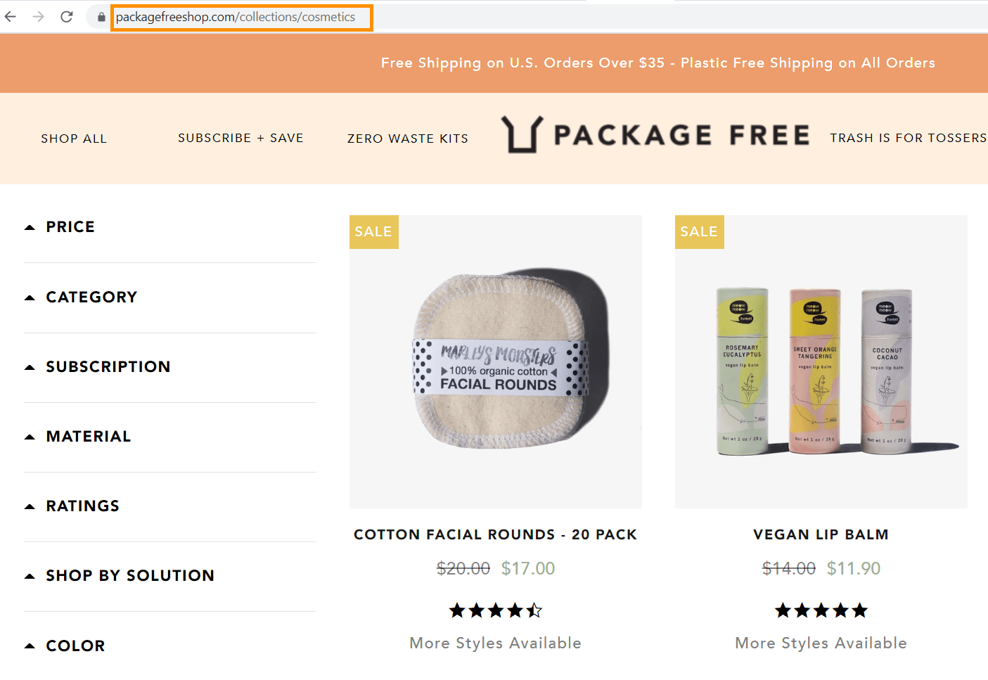
Here they use ‘Collections’ instead of category, and they follow it with the name of the category. As you can see, it’s very simple.
4. Choose the Right Categories and Tags
As I mentioned earlier, categories and tags are an important part of your Ecommerce website structure. But you can’t randomly pick them. They need to be chosen based on the keywords the user opts for.
First, start off by visiting some of your top competitors’ websites to see what categories and tags they use on their website. The categories that are working well for your competitors can become your main categories. While the ones that aren’t doing well, but compliment the main category should be placed as subcategories.
And the ones that aren’t as important as subcategories, but play a role in helping you categorize products should be used as tags.
Also, make sure that:
- All these category/subcategory pages are optimized for SEO with keyword-rich copy and metadata.
- You don’t have duplicate pages that lead to poor rankings, loss of link equity, and relevancy in the SERPs.
- Multiple pages don’t target the same page / keyword, which leads to keyword cannibalisation issue.
After you set up the categories and subcategories you should also set up heatmap tracking on your website. This, combined with your Google Analytics and SEO data, will help you figure out which of your categories, subcategories, and tags are working best.
If you find that a subcategory or tag generates more clicks and traffic than the main category, it would be better to make it into a category. You should also remove categories that visitors have no interest in. And when you do this, make sure you set redirects as this will improve SEO and prevent a 404 error from occurring if people find the page.
If you are a bit confused about which categories to create and how to track and collect the right data, you can use Shopify. They have many SEO and design experts who can help you design a user-friendly website that is also SEO optimized.
5. Create a Homepage That Links to Categories and Products
You should also set up a menu on your homepage that links to all the categories and subcategories on your website. Most of the people visiting your website will be new visitors. Therefore, the better you organize it with plenty of categories and subcategories, the easier it would be for them to find what they are looking for. You don't want users to rely only on the ‘Back’ button and run around your site in circles looking for the right product, do you?
For a good example, check out Petflow’s website.
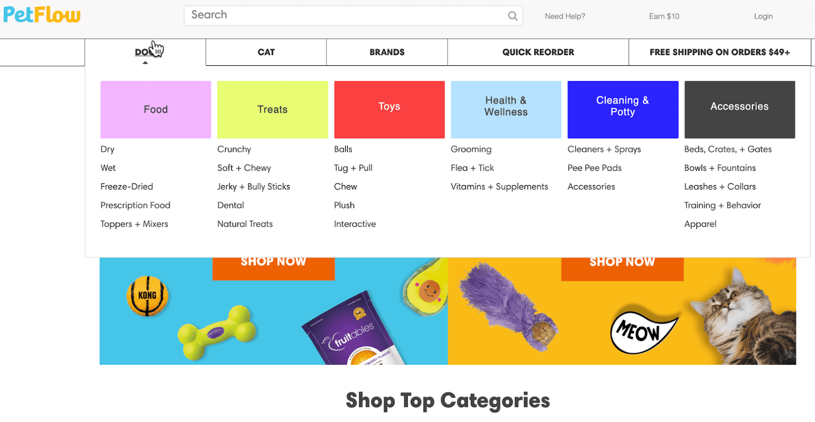
Their menu lists the categories as ‘Cats’ and ‘Dogs’. When you scroll over them, you see subcategories such as food, treats, toys, etc.
And when you scroll down the homepage, you see other things like the latest offers, discounts, top categories, top brands, etc. All of them make it very easy for first-time visitors to find the products they are looking for quickly.
The menu can appear on every page on your website, but the rest of the advertisement below can be restricted to the homepage. You can have links to other products on product landing pages too, but they should be minimal, especially around the main area, as too many recommendations can affect conversions.
6. Use Pagination for Categories
Another thing you should do is use pagination for categories, especially if you have a lot of products. For example, take Petflow. If you visit their dry dog food section, you will find that they have 1,231 items. If they listed them all under one page itself, it would load for ages.
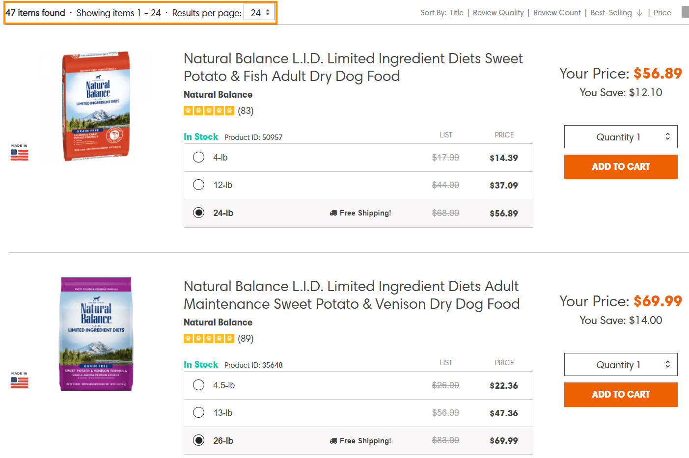
So, instead, they only display a minimum of 24 per page and allow you to click to the next page at the bottom of each page. They also give you the option to display more products on each page.
7. Extensively Use Internal Linking
Another thing that can help improve your Ecommerce website structure is extensive internal linking. Internal linking can make it easy for users to find relevant pages and products, establish a hierarchy, and improve website authority.
They might not be as powerful as external links from other high authority websites, but they do have a strong effect. For example, NinjaOutreach was able to increase their website traffic by 40% through internal linking.
You will, of course, get some form of internal linking through the menu and footer links on the homepage and the other landing pages on your website, but here are a few other tactics you can use to score some extra internal links.
- Use breadcrumbs. A breadcrumb is a navigation aid that can be added to your webpages. They can help viewers figure out where they are on the website. And at the same time, they will help with internal linking that can boost SEO authority and make it easy for search engines to understand your website structure.
A good example of breadcrumbs can be seen on the Avene USA website.
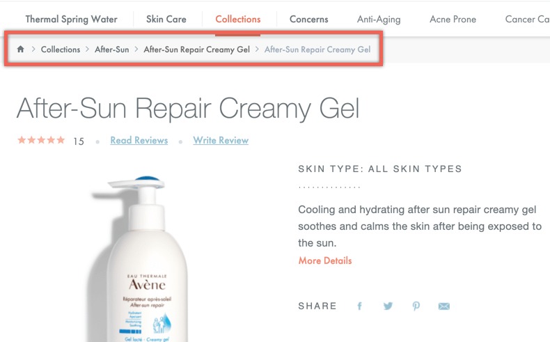
I can see which category/collection I am under, and I can even click on them and go back to the after-sun collection page, the collections page, or the homepage. This will make it easy to find relevant products and reduce the bounce rate.
- Link to relevant pages: You should avoid linking to relevant pages in the copy on the product landing pages, but you can link to them in places such as the blog posts, footer, etc.
- Place links to upsells and cross-sells: You can place links to upsells and cross-sells on the landing pages. This can help with internal linking and also increase your conversion rate.
If you are using a builder like Shopify, they have several upsell apps that can help you automate upselling and cross-selling.
The basic thing to keep in mind is that every single page on your Ecommerce store should have a link pointing to it from at least one other page on your store.
8. Fix Broken Links
Broken links can harm user experience as visitors can end up disappointed when they visit a link to a product they want to buy and find that the page doesn’t exist anymore. This will lead to a higher bounce rate and reduce the time on the page, affecting SEO.
Also, broken links can affect the structure of your website and your website SEO. This is why you should use a tool like Netpeak Spider to look for broken links and fix them.
You can fix things by redirecting links to the updated versions or a similar page version. If you added links to this page to the menu, or home page or other parts of your website, you should replace them too.
9. How to Check Ecommerce Website Structure with Netpeak Spider
You can take your website or your competitor’s website (if you want to get any insights for your own business) and run it through the Netpeak Spider program to see what deployment solutions work best and what created breaches in the website structure.
You can check website structure even in the free version of Netpeak Spider crawler that is not limited by the term of use and the number of analyzed URLs. Other basic features are also available in the Freemium version of the program.
To get access to free Netpeak Spider, you just need to sign up, download, and launch the program 😉
Sign Up and Download Freemium Version of Netpeak Spider
P.S. Right after signup, you'll also have the opportunity to try all paid functionality and then compare all our plans and pick the most suitable for you.
To do it, simply:
- Run the program, and enter your website’s initial address.
- In a sidebar, select the ‘Minimum’ template if your goal is only to check website structure (it will help significantly reduce crawling time).
- Hit the ‘Start’ button and wait until the crawling completes.
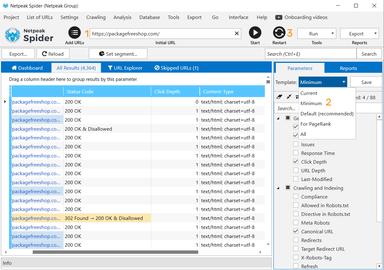
- The website structure will be displayed in the ‘Reports’ tab → ‘Site Structure’.
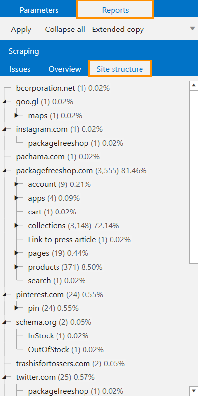
- If you need to comprehensively analyze your website or competitor’s website in terms of structure in the URL segments, go to the ‘Site Structure’ report in the ‘Export’ dropdown menu.
The Bottom Line
Having a good Ecommerce website structure is requisite to getting the most out of your SEO strategy. At the same time, it can have a strong effect on improving your conversion rate.
This is why before you begin to invest in other forms of SEO such as content optimization and link building, you should get the website structure right.
Constantly monitor your website structure by using Google Analytics, heatmaps, and SEO performance reports. You can use this data to regularly modify your structure until you create the perfect structure that is both SEO and user-friendly optimized.


