How to Optimize User Journey on a Landing Page
How to

The point in optimizing customer journey is make your user engage with target call-to-action elements of your landing page. Whether they've been researching for awhile or were simply that intrigued by an ad or social media post, they are now pretty deep into the funnel and quite possibly closing in on a conversion. Your task is to keep them on your landing page long enough to convince them to answer your call to action.
Landing page optimization is by no means a new concept. Web designers have been working at this since shortly after landing pages were invented. It's time to change how we approach this process. Rather than thinking about optimization at an atomic level first, it's time to prioritize creating great user experiences. The following strategies focus on the user's needs primarily.
1. Meet the User's Need for Speed and Readability
Nobody should have to wait for your landing page, struggle to navigate it, or think too hard when they read it. Ensuring that your landing page meets the immediate needs of your target audience is another important part of optimization.
First, there's no getting around it. Mobile pages should truly be mobile friendly. Before you get too confident about yours, put it to the test. Google's Mobile-friendly test is a great place to start.
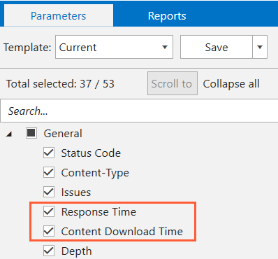
Next, consider page load speed. Expectations here are high, and potential customers will bounce rather than waiting for your landing page to load. You can check load speed using PageSpeed Insights or Netpeak Spider.
Readability can be divided into two categories. The first is legibility. Simply, is your landing page designed in a way that makes it a visually easy to read. As an example of poor legibility, check out the Space Jam website.
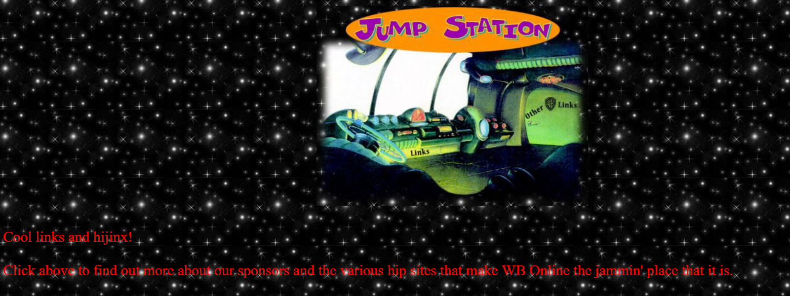
The text over image, pretty headache inducing. Imagine trying to read information about a special offer on a similarly designed landing page. Overuse of complicated fonts, not leaving enough white space and big, crowded paragraphs also contribute to a lack of legibility. Put thought and effort into page layout.
The second category relates to content. When it comes to landing page content, understanding what you've written should be pretty effortless. If readers have to stop and think about what you've written, that's pretty problematic. Avoid overly complex and flowery content. Use Readable.IO to double check the reading level of your content. Check out Hemingway to make sure your writing is concise and that you are embracing brevity.
2. Give The Gift of Consistency in Your Messaging
Quite a bit of this is common sense. Why would you spend money on targeted PPC advertising just to route people to a generic landing page? Even worse, why would you waste that click by sending them to your home page? If you aren't using ads to route to your landing page, it still doesn't make any sense not to use consistent messaging. It's like pointing someone down the funnel and pulling them back up to the top.
The best way to maintain that consistency is to do the following.
- Stick with the same offer. If you say 25% discount in your ad, include that on your landing page.
- Use the same fonts and color schemes.
- Pick the same symbols. Don't use '%' in your ad and then 'percent' on your landing page.
- Match your keywords.
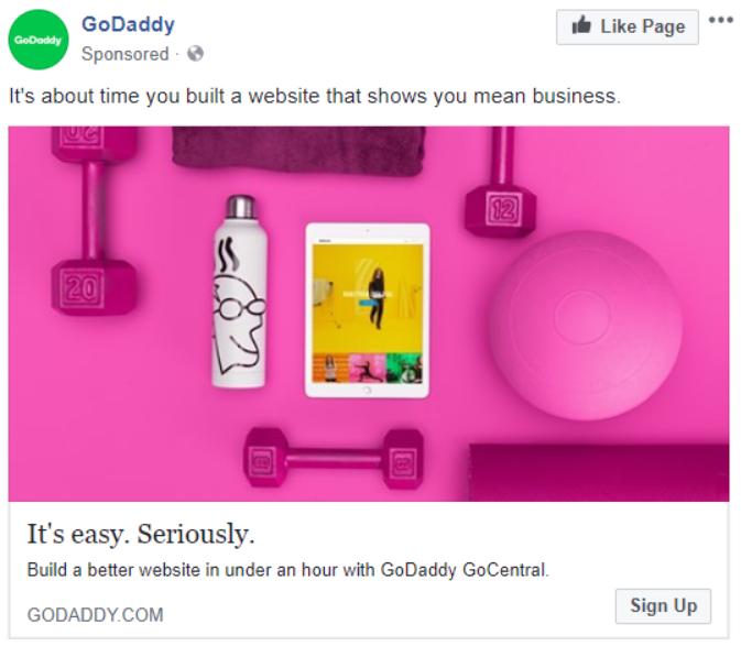
As an example, here's a sponsored post from GoDaddy.
And here is their landing page.
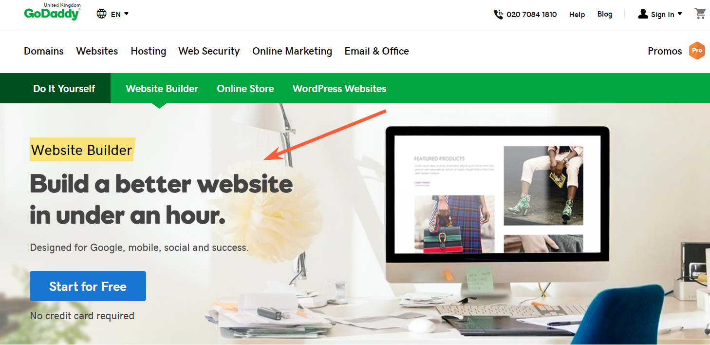
The focus is on building a better website in less than an hour. Keywords include GoCentral. Notice that the promise of under an hour carries over to the landing page. So does the 'athletic' theme.
3. Give Visitors an Immediate Sense of Trust
Virtually all of us have experienced surfing into a website and then immediately deciding that there is no way we're spending our money there. Frequently, the driving factor behind that is poor design. A sloppily designed website that looks as if it was thrown together in less than a day hardly screams, 'You can trust us with your credit card number!'. Invest in a professionally designed website. Your landing pages will be more functional, and you'll prove your commitment to quality.
It's one thing for you to say you are trustworthy. Trust badges indicate that third parties also agree your site is safe to use. Increase user confidence by using trust badges to ensure that your website meets standards for security. If there are badges you can earn that are specific to your industry or region, consider that a bonus.
Another way to establish trust is through testimonials, case studies, and data. In fact, WikiJob added customer testimonials to a landing page and A/B testing showed the page with testimonials earned a 34% increase in sales.
It's also important that testimonials stand out. Don't stuff them down at the bottom of your landing page. Check out the following professional translation services landing page from The Word Point.
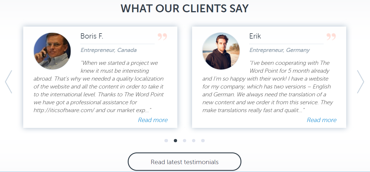
Always keep in mind that the conversion process often requires confidence from customer. So use every chance to provide it to them.
4. Help Your User Understand the Benefits of Your Offer
Explainer videos, product pages, white papers and other content sources are perfect for providing people with information on the unique and wonderful features of your products and services. With their limited space and users' frequent lack of patience, landing pages are not one those places. Focus on why they would benefit from your product, and why they should feel a sense of urgency about converting right now.
That doesn't mean you should ignore features entirely. In fact, one of the best ways to define the benefits of a particular product is to start with its features. List those. Then start working out how each of those features meets the needs of your target audience. Does it save them time, make a complicated process easier, or cost less money? Those are your benefits.
Next, focus on the benefits of answering your CTA at that moment. Reiterate any savings or other special offers. Create a sense of urgency. This can be accomplished in many ways including:
- Using a counter to indicate a limited number of products
- Displaying a deadline date for your offer
- Using phrases such as 'limited time only' or 'offer ends soon'
- Use subliminal keywords that trigger a sense of urgency (today, tomorrow, soon, immediate)
- Associate benefits with timeliness ('Save money today! Stop stressing over finances immediately!')
- Frame their problem as a matter of urgency ('You could be losing thousands in sales over the next 24 hours!')
These techniques can be used to motivate users to answer your CTA sooner rather than later.
In any case, don't be afraid to rely on emotions here. If your product can reduce frustration or make people happier, by all means say so. Remember that using emotionally charged power words can increase conversions.
5. Make Sure They Get the First Impression You Want Them to Get
Be careful of design blinders. When you work intently on creating a landing page, it's easy to begin 'seeing' what you want to communicate instead of what you actually are communicating. It may not be possible to maintain the objective perspective you need. Consider bringing in testers who have not participated in the design process.
One thing to try is the six second test. Have testers view the landing page for six seconds. Then, ask them what they recall. If what is memorable to them isn't what is important to you, it may be time to go back to the drawing board.
You have very little time to communicate and convince. Identify a very focused set of points you want to get across. Then optimize your landing page to make those clearly and quickly.
6. Provide Users with a Visually Attractive Experience
Pictures and videos do more than communicate your message. They also keep visitors on your page longer. Most importantly, they can boost conversions significantly.
For example, Vidyard added a video to one of their landing pages. This resulted in an increase in conversions of 100%. 37 Signals which is now Basecamp added a picture of a person and increased their conversions by more than 100%.
Don't dismiss the idea that images that are simply attractive can help. Even a nice looking background image or video can be visually compelling enough to maintain attention long enough for you to communicate your message.
7. Simplify The Conversion Process
Your goal should be to create as frictionless path to conversion as possible. The less people have to do to convert the better. Whether you are auditing an existing page or creating a new one, this should be a key priority. Here are a few things you can do to that end:
- Shorten and simplify forms.
- Pay attention to the way your content is layed out and ordered. It should be easy to 'consume'.
- Allow users to subscribe or login using their social media accounts.
- Ensure that you accept multiple forms of payment.
- Pay attention to user feedback about your landing pages.
- Test various incarnations of your CTA button to ensure the one you go with is clear and easy to find.
- Add contact information to your landing pages.
- Consider adding a chat feature so that users can access help without leaving the page.
Keep in mind that every time users encounter something that frustrates them, makes them uncomfortable, or confuses them, you increase the chance that they will bounce prior to converting.
8. Give Something Away
It's hardly an original idea. It may even seem a bit like pandering. After all, shouldn't your products stand on their own merits?
Push the thoughts out of your head. Giveaways are an old, tried and true trick for one simple reason. They work. They provide that last bit of incentive people often need to convert.
Best of all, giveaways don't need to be extravagant to work. Simply learning that they are getting something for free can cause an emotional trigger that gets potential customer enthusiastic about taking the next step. Some examples of giveaways are:
- Free extensions on warranties
- Membership upgrades
- Entries into sweepstakes or drawings
- Free product samples
- Digital gift cards
- Swag
- Access to premium content
- VIP customer support
- BOGO offers
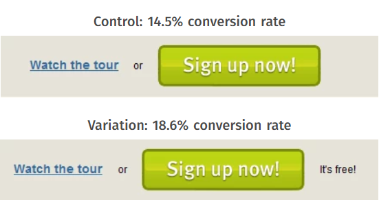
Sometimes, folks just need a reminder that what you are offering is already free. Social simply added the text 'It's free!' next to the call to action button on one of their landing pages. The result was an increase in conversions of 28%.
Giveaways can also be used to recapture potential customers before they bounce. If you've gone to exit out of a landing page only to see a pop up with a special offer encouraging you to reconsider, you have seen this technique in action. Consider A/B testing something similar on your landing pages.
Takeaways: The Benefits of a Great Landing Page Experience
When a potential customer arrives on your landing page, you have seconds to accomplish so much. There are some points you should remember while creating your landing page:
- You must deliver information that is clear and easy to understand.
- You must earn trust and establish thought leadership.
- Your messaging must be consistent.
- You must strive to deliver your content in a way that it is easily consumed regardless of device or browser.
- Don't hesitate to provide giveaways.
- Most importantly, your landing page must provide users with a frictionless experience that is visually compelling and makes the conversion process as simple as possible.
By implementing the strategies outlined above, you will create great landing page experiences for your potential customers. Not only will this lead to improved conversions, you will create a better customer purchasing journey overall.